Sears
At the beginning of 2015 I was tasked to lead the visual design efforts on the Sears (Shop Your Way) pitch. The whole process was super fast paced and our team managed to design two full user journeys in just a week.

The concept
This concept was called The Swiss Army Knife. The idea was to drastically simplify the users current Shop Your Way experience by serving them relevant content, tools and links only when needed. A simple and logical approach yet a big improvement to their cluttered and overly complicated designs.
In this direction the main menu became a simple left tool bar, visible at all times. We also came up with what we called the yellow bar assistant, which was basically a persistent module that would provide up to 3 links to the main actions you are most likely to take it at any given section.
Another important aspect of this redesign
was the drastic improvement proposed to their omni-channel customer experience, currently Sears, in partnership with several other retail brands such as Kmart, Best Buy, etc., provides a network of online and in-store services that not many other shopping hubs currently do. Our idea was to push this symbiotic relationship even further, making the experience of shopping either from the online hub (shopyourway.com) all the way to their heavily personal one-o-one in-store assistants, as smooth and integrated as these services can be.
In a nutshell, our biggest challenge on this project wasn’t how to create new products and services from scratch, but yet how to better organize their current content and tools, as well as proposing smarter ways of using their established retail channels in order to elevate the overall user experience.
"Bob's" user journey.
Homepage.
Heavily focused on active search (big top area), the Homepage would also provides the users quick access to their favorite categories (e.g. Cooking Essentials), You Subscriptions (and the ability to skip the delivery of that product at any month), Suggested Products based on your location and weather and finally, Suggested Products based on your past purchases (e.g. Complete your look).

Product listing page.
Checkout page.

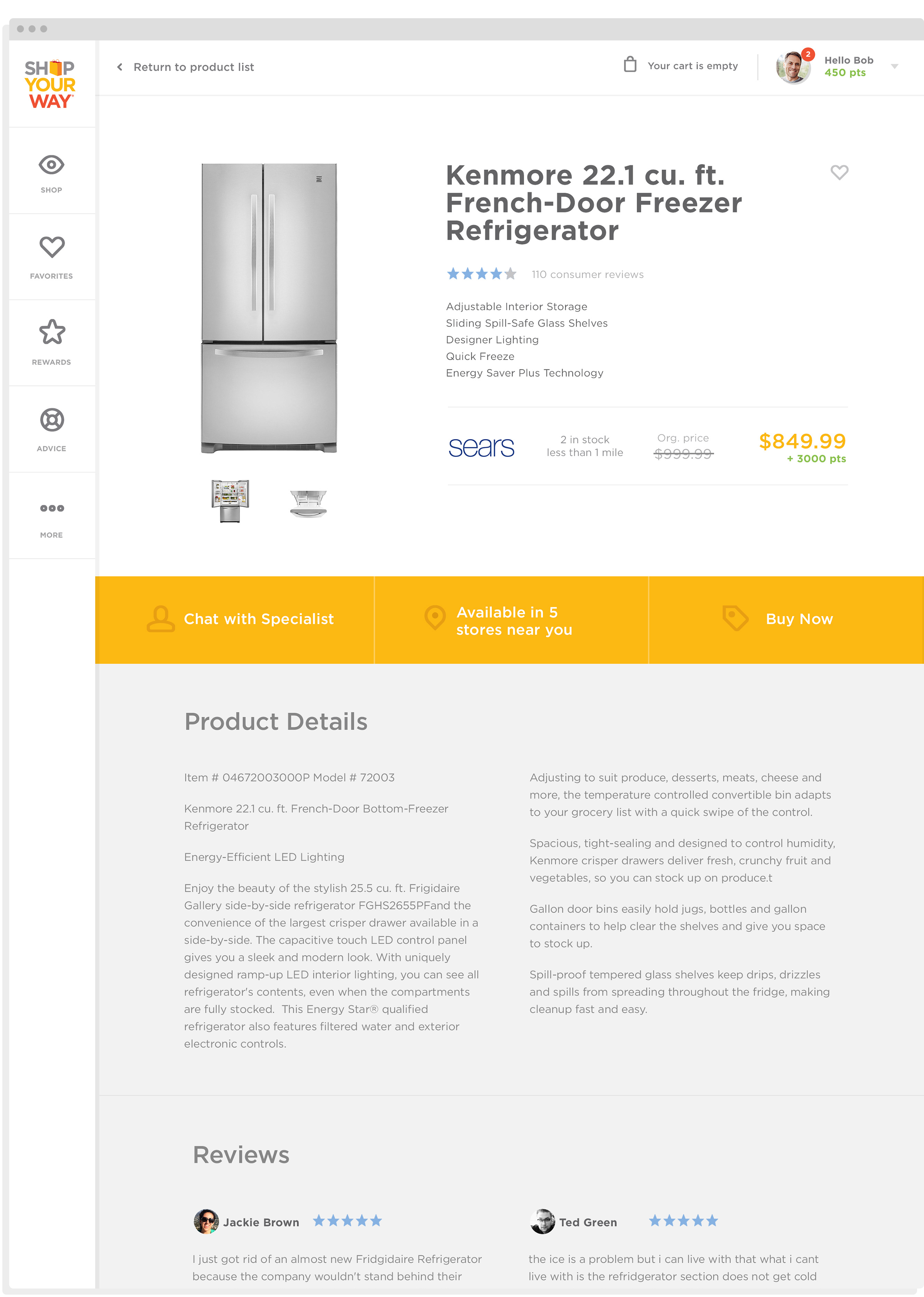
Product detail page.
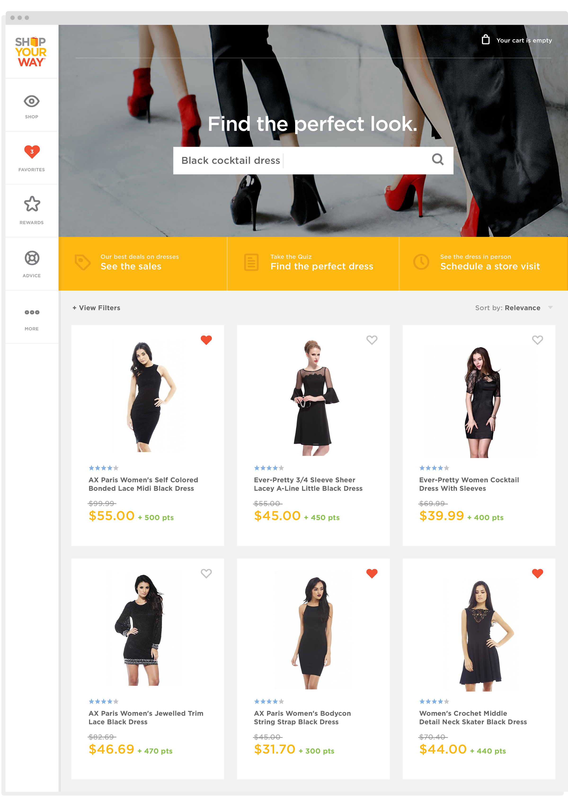
"Sadie's" user journey.
Credits
Agency: Huge
Client: Sears (Pitch)
Year: 2015
Creative Director: Charles Fulford
Senior Art Director: Andre Felipe Ribeiro
Visual Designers: Alicia Adamerovich and Julia Guo
UX Director: Christina White
UX Designer: Reed Enger