Morgan Stanley Redesign
In 2015, a completely overhaul of the Morgan Stanley website.


The concept
During this project we had a few challenges to solve: first how to create a design language that feels fresh but still on brand, and that would also live up to the good content Morgan Stanley was already producing. Their editorial team was creating great articles, white papers, thought leadership pieces, etc.
The second goal of the redesign was to better promoted their talents, showcasing the diversity of skills and ultimately humanizing the brand by highlighting the faces behind the success of the company. And by doing that we also started solving the third ask: the challenge of how to make the company not only appealing to their customers but also to future talents considering applying for a job.
Homepage. A combination of featured articles, job opportunities and bottom section promoting their talents.


Articles. A great reading experience, no matter where you are.

About Us.

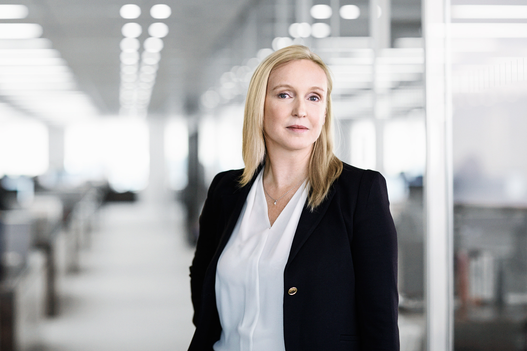
People. Celebrating the talents behind the success of Morgan Stanley.
Photography art direction of the featured employees.


A set of custom designed icons.
Credits
Agency: Huge
Client: Morgan Stanley
Year: 2015
Creative Director: Clark Morgan and Jon Jackson
Design Director: Sung Baik
Senior Art Director: Andre Felipe Ribeiro
Visual Designers: Rebecca Liebert and Tim Sullivan
UX Director: Amanda Forte
UX Designers: Alison Kudlow and Jocelyn Song
Developers: James Vecchio, Ning Yap and Jack Gold
Icons / Illustrations: Matt Anderson